Categories

A brand-new look for Two Rivers Housing
It’s a bright step forward for Two Rivers Housing, and we’re excited to finally reveal our new brand!
It’s far more than just fresh new colours and patterns – it’s a way of including all the things that makes Two Rivers Housing. We’ve summed it all up in our logo, which you’ll start to see on all our leaflets, letters and even our vans over the coming weeks.
Our rivers have been transformed and are now part of a circle, crossing over each other. In other words, they’re #Twogether, instead of separate like before – and act as a badge of honour for our team. Crossing over like this also looks like the structure of DNA, reminding us that great services and warm, safe, affordable homes are in our DNA and at the heart of the organisation.
Speaking of hearts, the light blue river in the logo is curved like the rhythm of a heartbeat – showing how we’re at the heart of the community.
We’ve also changed the font of our logo so it’s now much easier to read, and by stacking the words, we’ve created the sloping shape of a roof.
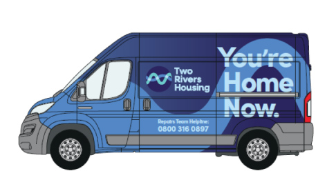
One thing that’s also changed is our strapline – the phrase that sums us up. You’re Home Now is a statement that’s warm and unmistakeably clear.
For tenants, it’s about more than bricks and mortar – it’s all about security, belonging and community. It’s your place, your home. For our team, it means that Two Rivers Housing is a place for them to belong, take pride in and make a real difference.
To create this new brand, we worked with tenants and colleagues from across the organisation at every level, from our senior management team to apprentices to get their opinions and make sure we built something that felt right to them.
And, as we bring our repairs team fully into the Two Rivers fold, this new brand is helping to bring everyone together and builds on the changes we are already making to ensure Two Rivers Housing is working harder for tenants.